Pax Mentis branding
Pax Mentis branding
Pax Mentis branding
giving customers and the client peace of mind.
giving customers and the client peace of mind.
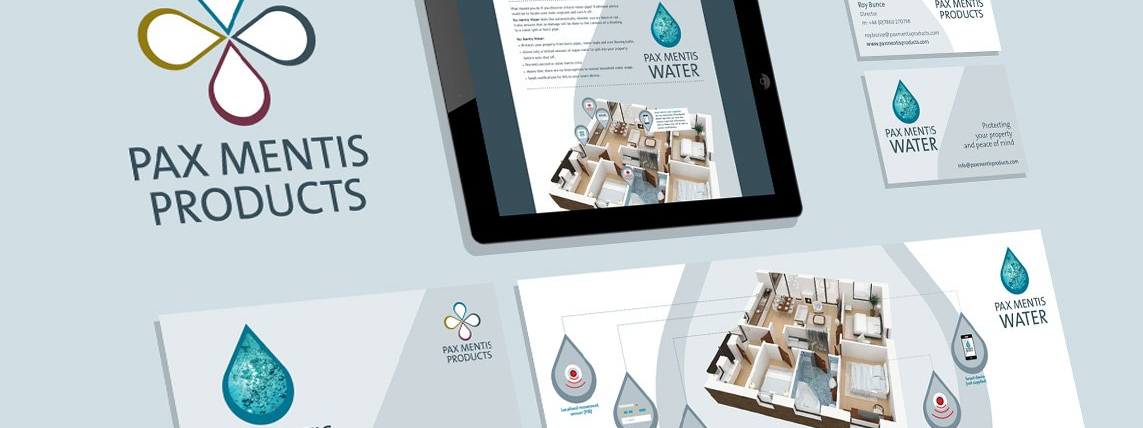
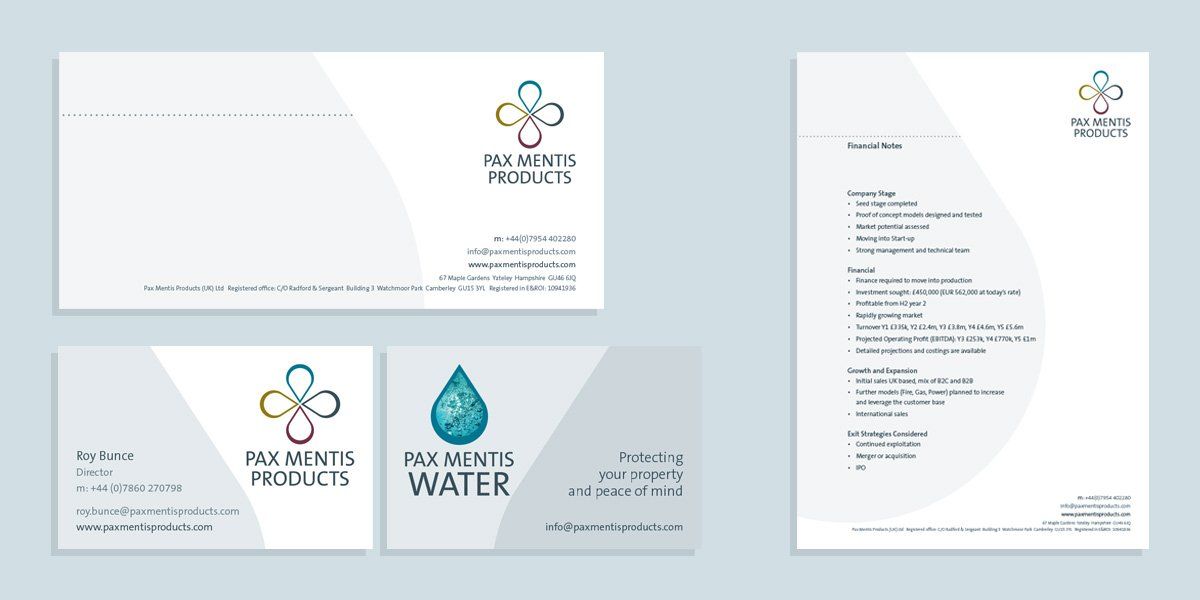
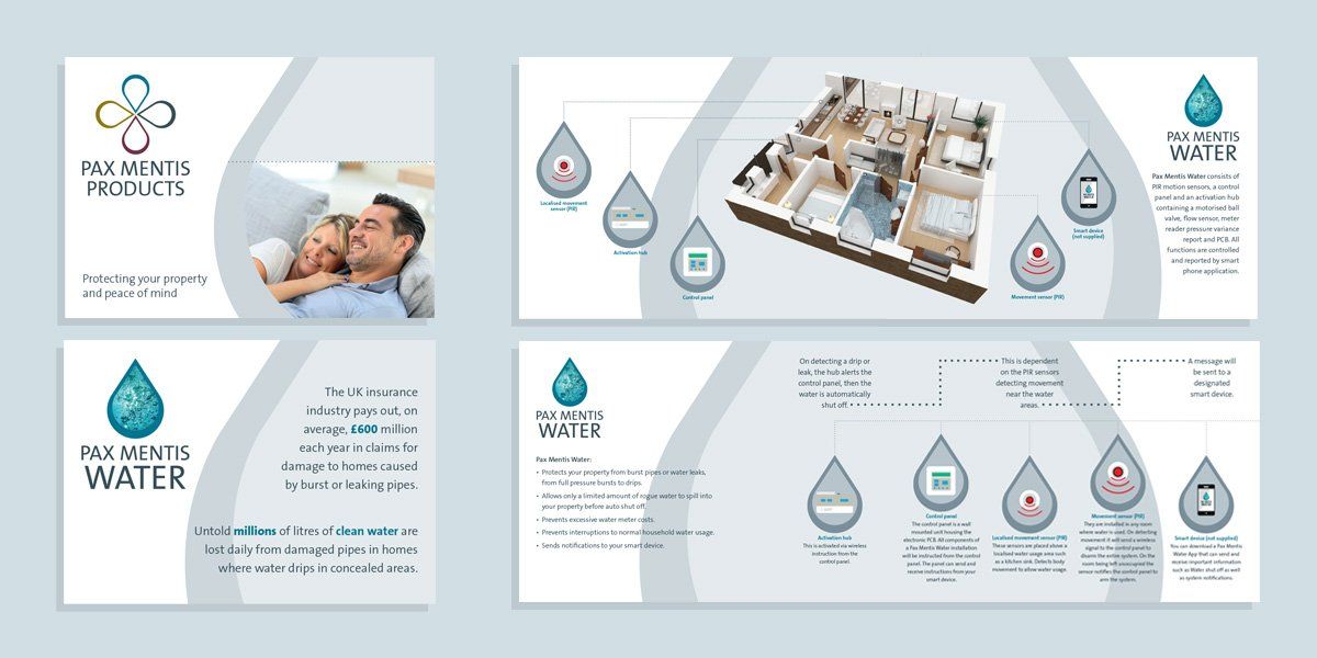
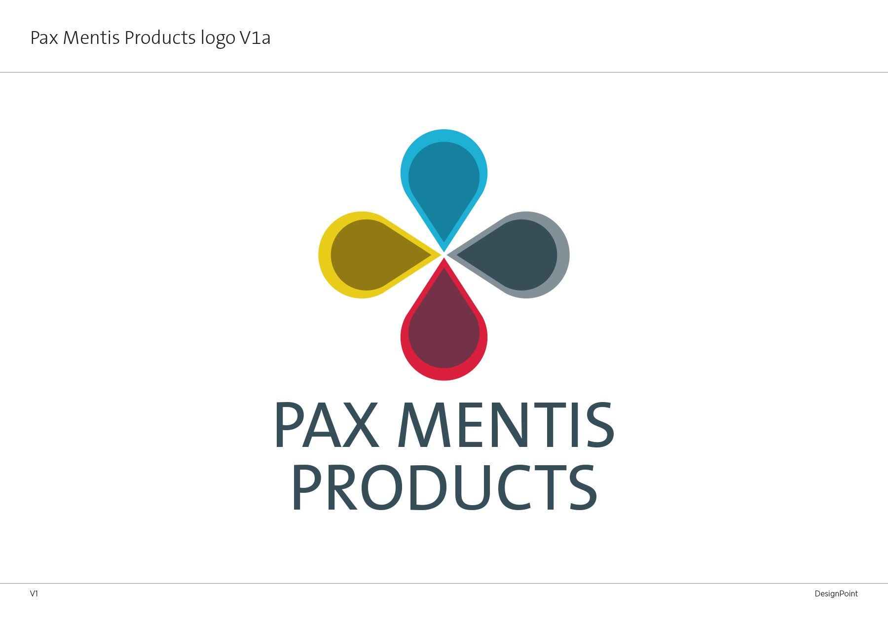
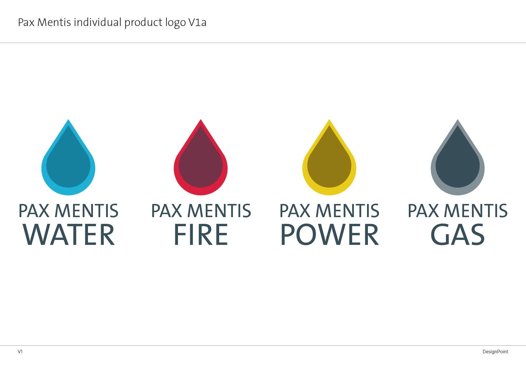
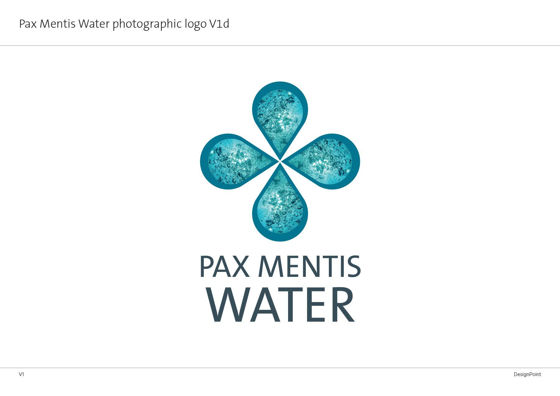
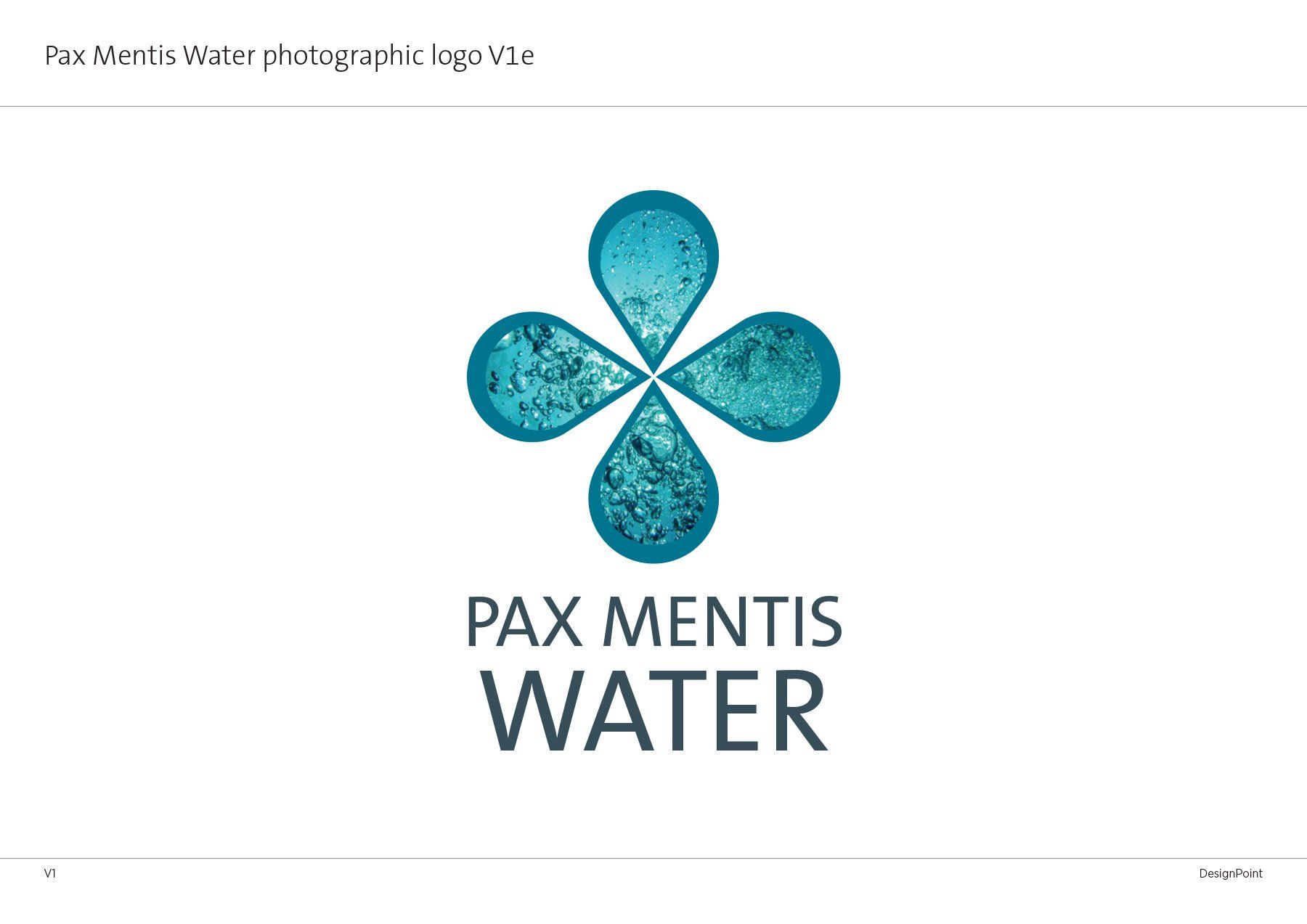
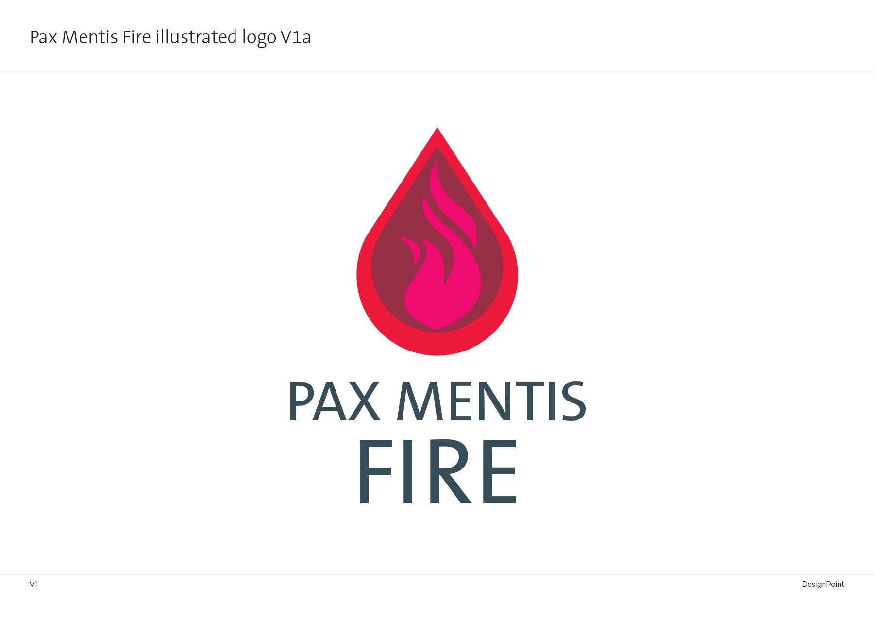
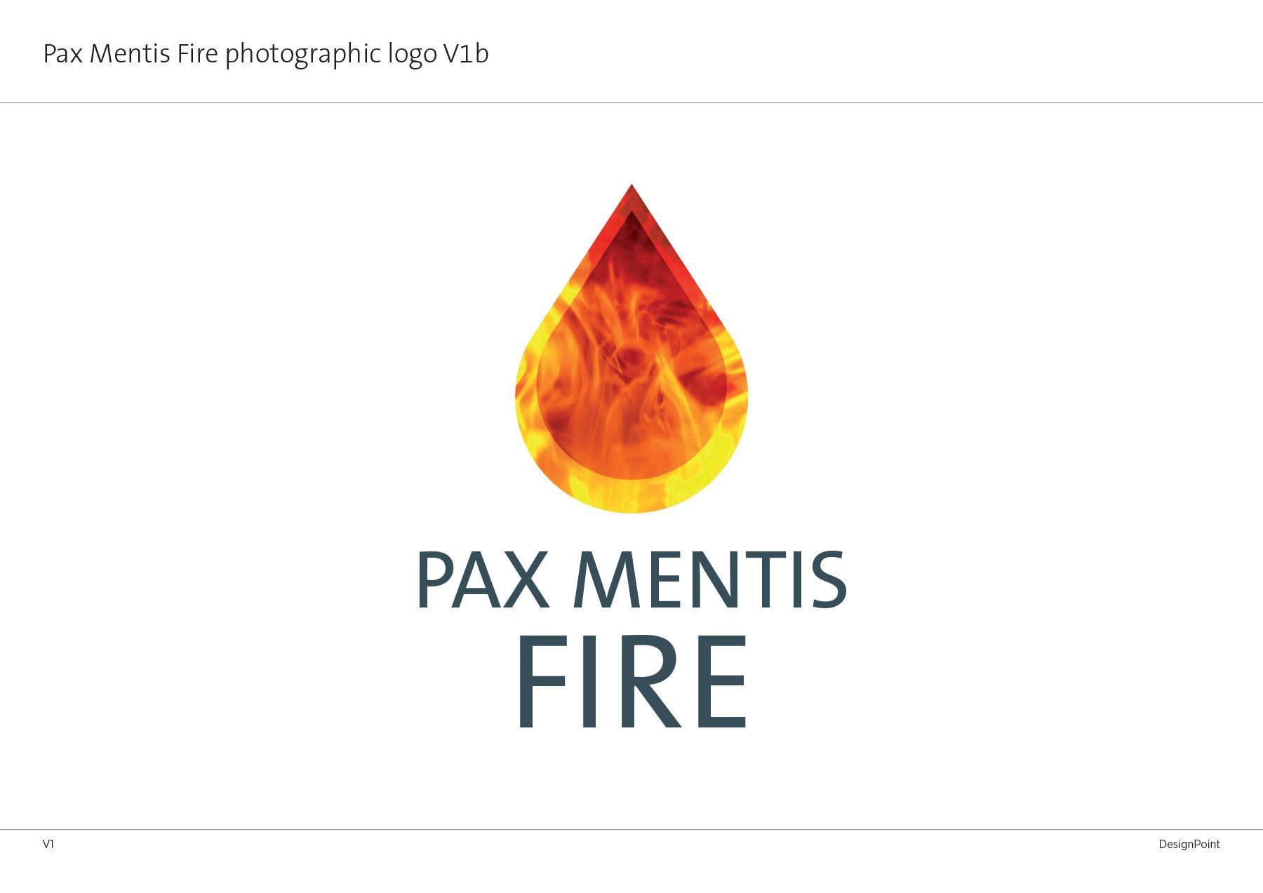
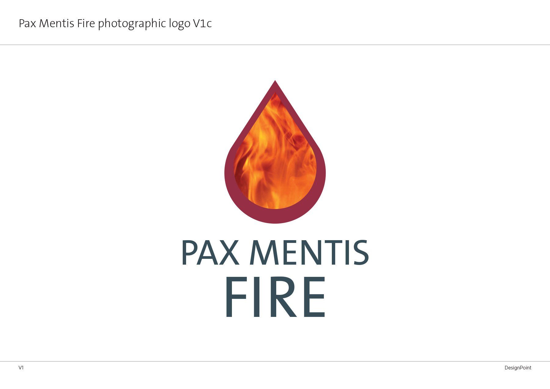
The translation of 'Pax Mentis' is 'peace of mind', this needed to be reflected in the branding, a solid and dependable company who can be relied on. The colours chosen for each of the four sectors of the company are muted primary colours which accurately represent the sectors themselves; blue for water, red for fire, yellow for electricity and grey for gas.
the challenge
the challenge
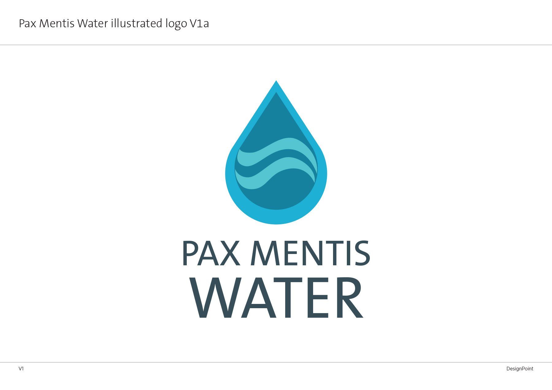
The main challenge for this brief was to produce a logo that could be used one way to show the complete range of the company as well as be able to break it down into separate components. Therefore it needed to be flexible and simple. I chose the tear shape as it initially represented their initial product 'Pax Mentis Water', the other elements were to be used further along the development process but as you can see from the initial pdf presented to the client, these had been thought about as well. This is very important when developing brands, a thorough understanding of the clients vision and potential development helps create a logotype that can evolve and adapt as the company does.
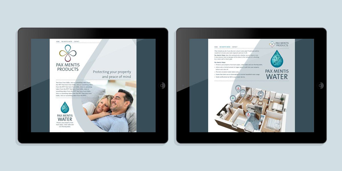
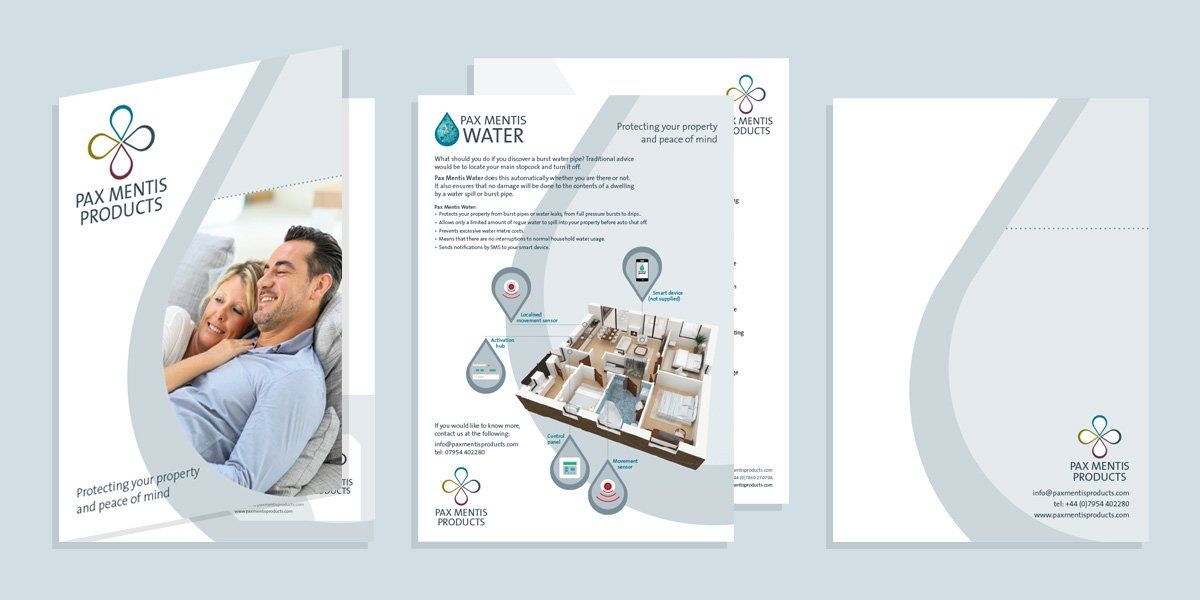
the result
As well as the initial master logo, the client requested a complete kit of parts so that they could take the product to market, these inlcuded: stationery, a folding leaflet, folder with inserts, website and a landscape and portrait version of the brochure some of which are shown above.
other case studies
other case studies
-
![]()
Posh Plants branding
ButtonTitle or short description
-
![]()
-
![]()
-
![]()